Use real bead colors
Map the image to Perler, Hama, Artkal A, Nabbi or Mard reference palettes instead of generic screen colors.
Free browser-based converter
Turn a favorite photo into a buildable grid, then fix the details bead by bead. Choose a real brand palette, limit the design to colors you own, see exact counts, and print a clean pattern sheet.

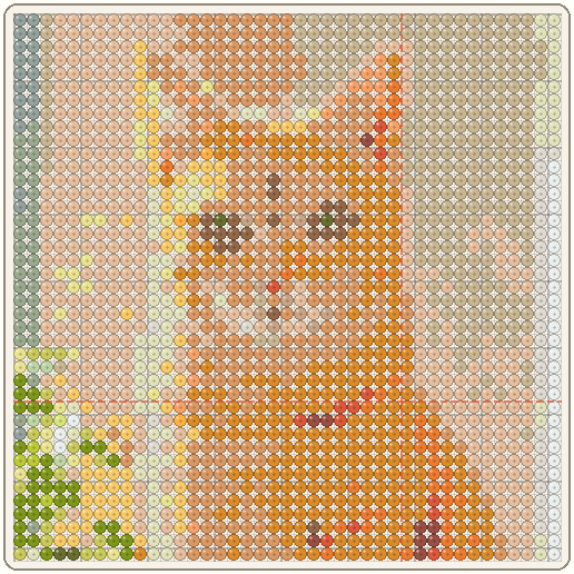
Edit the result, not just the settings
Automatic conversion gives you a starting grid. The editor gives you the control to make that grid practical before you spend time placing beads.
Map the image to Perler, Hama, Artkal A, Nabbi or Mard reference palettes instead of generic screen colors.
Paint, erase, fill, pick a color, undo changes and simplify noisy edges directly on the generated pattern.
See bead totals by code, pegboard coverage and finished size, then download a PNG or print at true bead pitch.
Photo-to-grid examples
Portraits benefit from clear silhouettes, while scenic images usually need a wider grid and a deliberately reduced palette.
Keep the eyes, ear shape and facial markings; simplify stray fur and background detail.

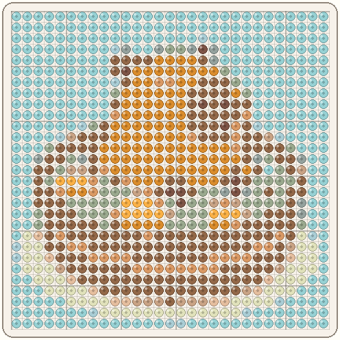
Bold shapes survive a smaller grid, so the warm face and citrus accents stay readable.

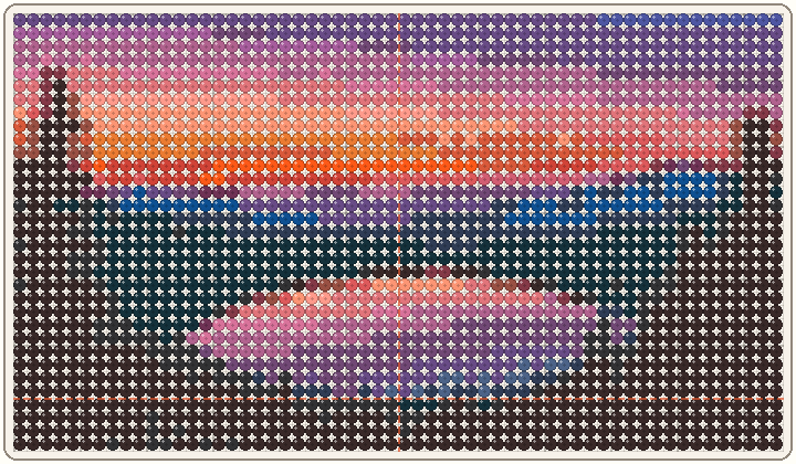
A wider grid preserves the moon and reflection while a focused palette keeps the scene buildable.
Match the settings to the source
Grid width and color count work together. Add size only when it preserves an important shape, and add a color only when it makes a feature or boundary easier to read.
Begin with one face filling most of the crop and use even, front-facing light when possible. A 29-bead width can work for a graphic head-and-shoulders portrait; use 58 beads when you need recognizable eyes, glasses, markings or a more natural head shape. Try 12–20 colors, then remove near-duplicate skin, fur or background shades that create scattered single beads. Zoom out while editing to confirm that the expression still reads at a normal viewing distance.
Use the cleanest source available, with solid fills and no JPEG halos around letters. Pixel Art mode usually gives the most predictable edges, while a low color limit keeps marks and icons crisp. Check every diagonal and narrow letter stroke in edit mode: one misplaced bead can close a counter, break a line or make small text unreadable. When the source already uses a fixed palette, restrict My bead box to close physical matches before regenerating.
Crop around one focal point instead of shrinking an entire wide photograph onto one board. Start at 58 or 87 beads across and group fine texture into broad light, middle and dark regions. Reflections, horizons and architectural edges should stay continuous; isolated foliage, gravel and cloud pixels are usually better simplified. Review total beads and board seams early because a detailed scene grows much faster than a compact portrait.
Quality check
First, inspect the silhouette, eyes and other recognition points with the grid shown at normal size. Remove isolated cells that add a color change without helping the subject. Use paint, erase and fill to strengthen edges and simplify noisy areas such as hair, fur, reflections or compressed image artifacts. If the subject reads only at extreme zoom, increase the grid width or simplify the crop rather than depending on fragile one-bead details.
Next, check the physical plan. A seam through an eye, narrow letter or focal edge can make assembly harder, so adjust the crop or width when a small change moves that feature away from the join. Compare the live material totals with your bead supply and keep extra beads beyond the exact count for corrections. Screen previews are planning approximations, so test close shades with physical beads before committing to a large portrait.
Save a comparison export before making major edits. Try one version with fewer colors and another at the next board-width preset, then compare both at the size the finished piece will be viewed. Choose the smaller design when the outline and key features remain clear; choose the larger one only when its extra cells preserve meaningful detail. Keep the clean source photo as well, because converting an already reduced grid again can introduce blocky edges and inaccurate color regions.
Finally, choose labels that remain easy to follow on paper. Turn on color codes or symbols when neighboring shades look alike, add coordinates for a multi-board build, and keep the same board orientation from sheet to sheet. For true bead-size printing, use 100% scale with fit-to-page disabled and measure the 50 mm scale bar. A correct scale prevents the guide from drifting away from the peg spacing as you build.
Practical workflow
Start by cropping tightly around the subject. Empty background and tiny distant details consume beads without helping recognition, so a close crop is usually the biggest quality improvement you can make.
Open the converter and choose Photo mode. Set a grid width that matches the detail you want and the pegboards you have: 29 beads spans one standard square board, 58 spans two, and 87 spans three. Keep the aspect ratio intact so faces and circles do not stretch. Begin with enough colors to preserve the important shading, then lower the color count until the materials list feels realistic.
Next, inspect the silhouette, eyes, high-contrast edges and small isolated color clusters. Use paint and erase to remove visual noise, fill to simplify larger regions, and the owned-color filter when you want the converter to use only beads already in your box. Screen colors are planning approximations, so compare difficult shades with physical beads before a large build.
Finally, review the bead count and board layout. Turn on color codes or symbols if adjacent shades are hard to distinguish, then download a PNG or print the pattern. When printing at real bead size, verify the 50 mm scale bar before placing the sheet under a board or ironing paper.
Questions before you convert
Open the converter, choose or paste a photo, select Photo mode, set the grid width and color limit, then edit individual beads before downloading or printing the guide.
No. The source image is sampled inside your browser and is not sent to an image-processing or storage endpoint. Exports stay on your device.
Use a tightly cropped subject, a simple background, clear edges and even lighting. Pets, portraits, logos and centered objects usually convert more cleanly than busy scenes.
Try 12–24 colors for a first pass. Reduce the count if the materials list is impractical; increase it only when the added shades preserve an important facial feature or edge.